The following documentation describes each particle type and lists the specific form fields used to configure them.
Particle Types and Field Configurations
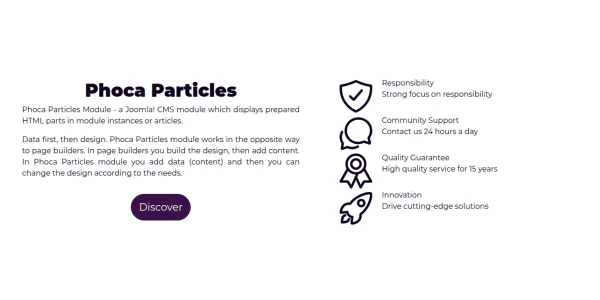
1. Feature Box
A standard layout used to highlight specific features of a product or service.
Following form fields are used when setting:
- Main: Title, Description, Background Image
- Items: Image or Icon, Title, Title Prefix, Title Suffix, Description, Button

2. Feature Row
Similar to the Feature Box, but formatted specifically for a horizontal row arrangement.
Following form fields are used when setting:
- Main: Title, Description, Background Image
- Items: Image or Icon, Title, Title Prefix, Title Suffix, Description, Button

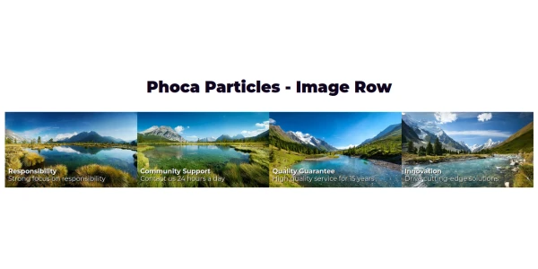
3. Image Row
A row layout dedicated to displaying images with optional text identifiers.
Following form fields are used when setting:
- Main: Title, Description, Background Image
- Items: Image, Icon, Title, Title Prefix, Title Suffix, Description
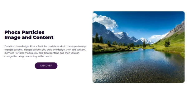
4. Image and Content
A split layout combining a prominent image with a rich text content area and buttons.
Following form fields are used when setting:
- Main: Title, Description, Content, Button, Label, Original Price, Price. Image, Background Image
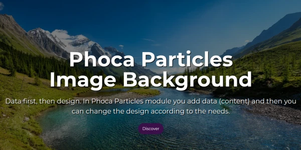
5. Image Background
Places content, icons, and text over a background image.
Following form fields are used when setting:
- Main: Title, Image, Description, Background Image, Button
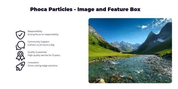
6. Image and Feature Box
Combines a main image with a structured feature box element.
Following form fields are used when setting:
- Main: Title, Description, Content, Button, Label, Original Price, Price. Image, Background Image
- Items: Image, Icon, Title, Title Prefix, Title Suffix, Description, Button
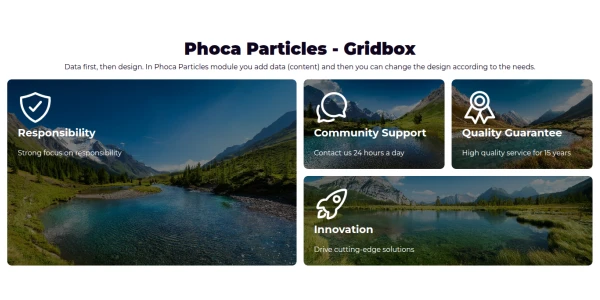
7. Grid Box
A versatile grid container that can hold icons, images, and text.
Following form fields are used when setting:
- Main: Title, Description
- Items: Icon, Title, Title Prefix, Title Suffix, Description, Content, Image, Button
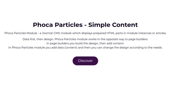
8. Simple Content
A straightforward layout for basic text and image pairings.
Following form fields are used when setting:
- Main: Title, Description, Image, Background Image, Button. Label, Original Price, Price
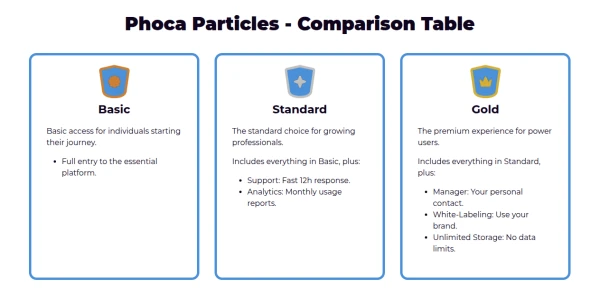
9. Comparison Table
A structured layout designed to compare features or pricing side-by-side.
Following form fields are used when setting:
- Main: Title, Description, Background Image
- Items: Icon, Title, Title Prefix, Title Suffix, Description, Content, Button
10. Simple Button
A minimal particle for placing a call-to-action button with a description.
Following form fields are used when setting:
- Main: Title, Description, Button, Background Image

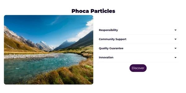
11. Content and Feature Box
A layout focusing on HTML content alongside a highlighted feature box.
Following form fields are used when setting:
- Main: Title, Content, Description, Button, Background Image
- Items: Title, Title Prefix, Title Suffix, Content, Description, Icon, Button
12. Image and Feature Accordion
Combines a static image with an interactive accordion for expandable content.
Following form fields are used when setting:
- Main: Background Image, Image, Button
- Items: Title, Title Prefix, Title Suffix, Content, Description, Button
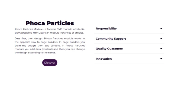
13. Content and Feature Accordion
Pairs standard HTML content areas with interactive accordion menus.
Following form fields are used when setting:
- Main: Background Image, Title, Content, Description, Button
- Items: Title, Title Prefix, Title Suffix, Content, Description, Button
14. Image Rotate
Displays an image within a frame that includes rotating or descriptive elements.
Following form fields are used when setting:
- Items: Image, Title, Description, Suffix


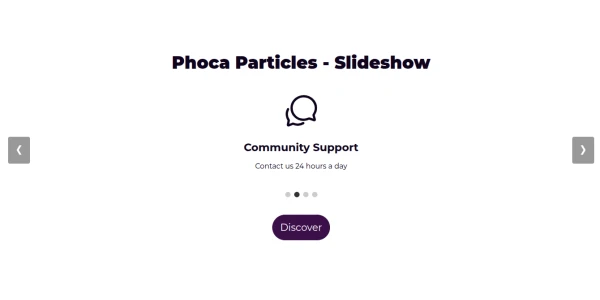
15. Slideshow
A classic slider element used to display a rotating series of images.
Following form fields are used when setting:
- Main: Title, Description, Background Image
- Items: Image, Icon, Title, Description or Content
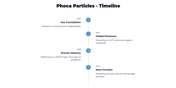
16. Timeline
A vertical sequence of events, often using dates as prefixes.
Following form fields are used when setting:
- Main: Title, Description, Background Image
- Items: Icon, Title, Title Prefix (Date), Description or Content, Button
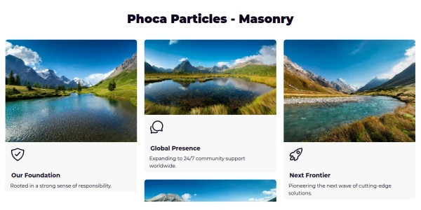
17. Masonry
A grid layout script that positions elements optimally based on vertical space.
Following form fields are used when setting:
- Main: Title, Description, Background Image
- Items: Image, Icon, Title, Description or Content, Button
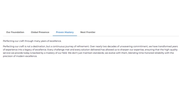
18. Tab Content
Organizes information into separate tabs to save page space.
Following form fields are used when setting:
- Main: Title, Description, Background Image
- Items: Icon (Tab), Title (Tab Label), Description, Content, Image
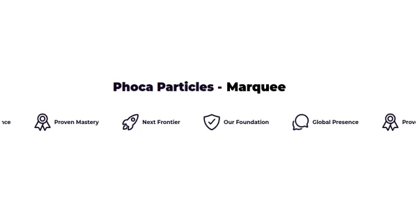
19. Marquee
A scrolling text or image area, typically for announcements or logos.
Following form fields are used when setting:
- Main: Title, Description, Background Image
- Items: Image or Icon, Title
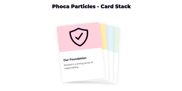
20. Card Stack
Displays items in a stacked format that can be navigated through.
Following form fields are used when setting:
- Main: Title, Description, Background Image
- Items: Image or Icon, Title, Description
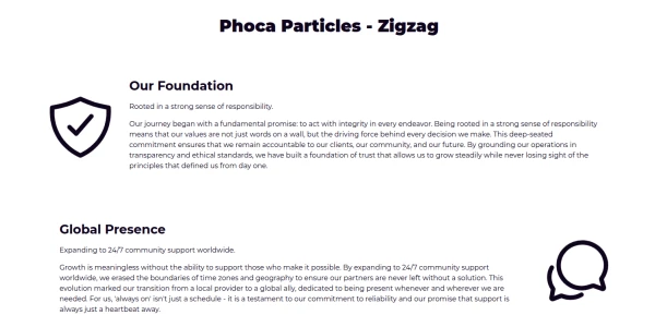
21. Zigzag
An alternating layout where the image and text switch sides for each item.
Following form fields are used when setting:
- Main: Title, Description, Background Image
- Items: Image or Icon, Title, Description, Content, Button
22. Icon Row List
A list where each item is identified by a prominent icon or image.
Following form fields are used when setting:
- Main: Title, Description, Background Image
- Items: Icon or Image, Title, Description or Content, Button
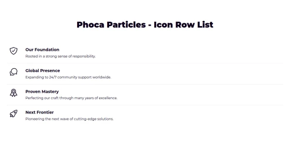
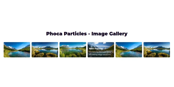
23. Image Gallery
A collection of images displayed with dedicated captions.
Following form fields are used when setting:
- Main: Title, Description, Background Image
- Items: Image, Title (Caption), Description (Caption)
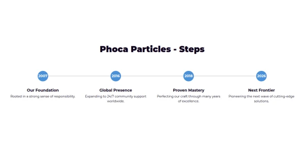
24. Steps
A process indicator showing numbered stages, such as Step 1 or Step 2.
Following form fields are used when setting:
- Main: Title, Description, Background Image
- Items: Icon, Title, Description or Content, Prefix (Step Num)
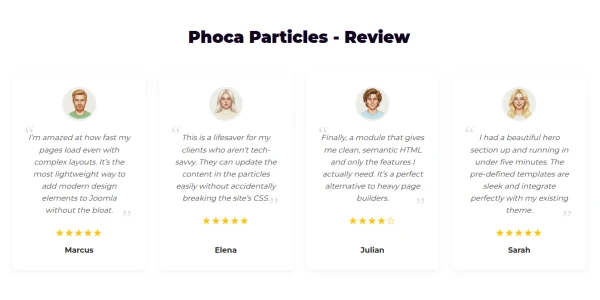
25. Review
Designed for testimonials, featuring avatars and star ratings.
Following form fields are used when setting:
- Main: Title, Description
- Items: Image (Avatar), Title (Name), Prefix (Rating 1-5), Description (Quote), Button
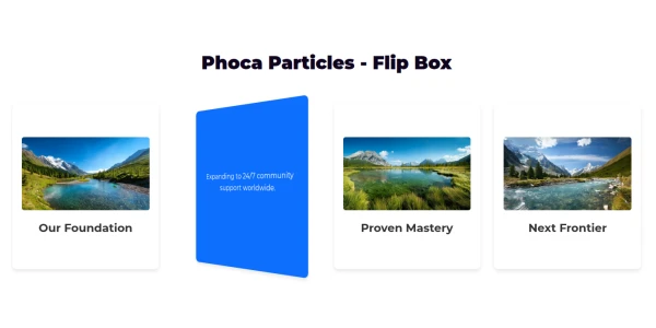
26. Flip Box
An interactive box that flips to reveal secondary content on the back.
Following form fields are used when setting:
- Main: Title, Description
- Front: Image or Icon, Title
- Back: Description or Content, Button
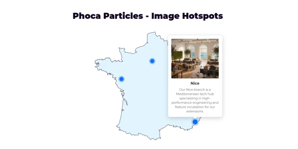
27. Image Hotspots
An interactive image where specific coordinates reveal tooltips.
Following form fields are used when setting:
- Main: Image or Icon SVG (The Map/Product), Background Image
- Items: Title, Description or Content, Image, Button (Tooltip content)
- Coordinates: Prefix = Top %, Suffix = Left %