
Users of Joomla and the Phoca Cart e-commerce extension often share their websites and ask questions on the Phoca Forum. This valuable feedback frequently highlights common errors they make when operating their online stores.
We've observed the following mistakes on the websites of users who referenced their sites while asking questions about Phoca Cart in the forum. These are just a few examples; if you've encountered other issues, please let us know so we can update this article.
These errors range from visual design flaws to content-related issues. Let's delve into some of them.
Design-Related Issues
1. Poor Product Photography
One of the most significant mistakes is investing time into building an e-commerce store but neglecting to create high-quality product photos. It's crucial to remember that your product photos are often the most important selling point on your e-shop. They are what truly sell the product.
In today's digital age, with readily available desktop and online tools for tasks like background removal, it's a huge missed opportunity not to utilize them. Your photos need to be appealing, and you should analyze whether the background should be part of the product image or not. For example, when selling furniture, it might be beneficial to show the product in a room setting to provide context. However, for smaller items, it's generally better to remove the background, allowing the product itself to stand out.
Often, removing the background and displaying the product in as much detail as possible is desirable. A distracting or unappealing background can draw attention away from the product. You can see the difference in the picture, where the left picture that shows the product in detail is much more interesting than the blurry picture with a distracting background.

2. Inconsistent Image Formats and Sizes
Always strive to have all your product images the same size and format (landscape or portrait). When each image has a different size, it looks unprofessional and unappealing. Dedicating extra time to preparing your e-commerce images is essential.
Inconsistent image formats and sizes make your product listings look disorganized.

If you have basic graphic editing skills, this doesn't have to be complicated. Here's an example using Inkscape:
- Create an image canvas in Inkscape, perhaps a 512x512px document.
- Remove the background from your product photos using an online service.
- Paste the product photo into your canvas and resize it as needed to ensure all products appear similarly sized.
- Export the image with a transparent background (PNG, WEBP) and then upload it to your system.
Following these steps will result in consistent, uniform images without distracting backgrounds, making your product listings look organized and increasing your chances of attracting customers.

3. Missing Shopping Cart Module
We've noticed some websites lack a visible shopping cart module. Users add items to their cart but have no visual confirmation or list of what's in their cart. It's recommended to display at least a shopping cart icon, typically in the top-right corner, visible on both mobile and desktop views. It's also good practice to display a notification that an item has been added to the cart, which Phoca Cart can do via a popup modal window.

A common issue is the lack of feedback after adding an item to the cart - no confirmation, no visible cart contents. Phoca Cart offers modules for this; it's wise to use them.
Once a user adds something to their cart, a modal box should appear with confirmation, and they should then be able to click on the cart icon to view their cart contents (e.g., in an off-canvas display).

4. Insufficiently Prominent "Add to Cart" Button
Sometimes, due to a poorly chosen template, crucial buttons like the "Add to Cart" button aren't prominent enough and might look more like highlighted text. Such buttons can confuse users and hinder the purchasing process.
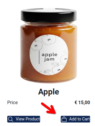
Always ensure your "Add to Cart" button clearly looks and functions like a button.
5. Overly Long Button Labels
In some languages, button texts can be excessively long, causing buttons to overlap. This is particularly common in German, where you might have two side-by-side buttons like "Produkt Anzeigen" (Show Product) and "In den Warenkorb" (Add to Cart).

When these buttons collide due to their length, it needs to be addressed. Several solutions are available:
- Use the latest Phoca Cart version, where buttons are aligned using Flexbox.
- Hide the text and display only an icon for the less significant button (Phoca Cart has a setting for this).
Design challenges can sometimes seem insurmountable, requiring an individual approach to find the best solution. For example, if you want two buttons aligned to the sides when they fit on one line, but centered and stacked when they don't. CSS Flexbox can handle displaying two buttons in a row and wrapping them to a new line if they don't fit. However, what it cannot do dynamically is change alignment (e.g., space-between when two buttons are on a line and center when there's only one). No CSS rule exists for this, so a compromise must be chosen individually for each website.
The following image shows center alignment when two buttons don't fit on a single line.

6. Missing Icons on Buttons
This usually happens due to a poorly chosen template that conflicts with standard icon fonts. Recent Phoca Cart versions default to SVG icons, so this problem should ideally no longer occur.
![]()
However, some sites still exhibit this issue. This can be easily solved. Install the latest version of Phoca Cart and select SVG as the icon type in the settings.
7. Inappropriately Chosen Color Scheme
Each industry often benefits from a specific color scheme. While exceptions exist where a seller uses a unique color palette, it's generally advisable to adhere to a color scheme for your website, logo, and marketing materials that is typical for your industry. If you're unsure, feel free to ask on the Phoca Forum; we're happy to provide guidance.
8. Double Popup Modals
When a customer adds an item to the cart, a modal popup window should appear. Some templates might load certain JavaScript and CSS libraries twice, leading to a duplicated modal.

You need to monitor this and either disable it in the template or replace the template entirely with a more modern and standard one.
9. Not Mobile-Friendly
Although most templates are responsive today, product displays on mobile devices might not always be correct. It's crucial to test your chosen template to ensure everything appears correctly on mobile. Phoca Cart also offers various settings, such as the number of columns for product display on mobile devices. Phoca templates also utilize mobile-friendly techniques for displaying menus, filters, carts, and more.

Content-Related Issues
1. Insufficient Product Descriptions
Product descriptions are a vital part of your e-shop, serving both your customers and search engines. Please remember to describe all your products thoroughly. If some products are similar, it's good to differentiate them using specifications, allowing customers to compare them easily. Detailed descriptions are crucial for customer decision-making and help them choose the right product.
2. Missing Stock Information
Customers need to know if a product is in stock or not before they can make a purchase. Clearly display stock availability for each item.
3. Poor Website Navigation
Complicated or confusing navigation makes it difficult for users to find what they are looking for. Try to simplify your navigation and include only the most important links in your menu, so customers aren't confused and can quickly get to where they need to go. Always be sure that whatever page the user is on, there will be main e-shop link available.
4. Not Having a Clear Return/Refund Policy
Customers may hesitate to buy if they're unsure about your return or refund process. Provide a clear, easy-to-find return and refund policy that reassures customers about their purchase.
5. Not Engaging with Customer Feedback
Ignoring customer reviews, questions, and feedback can harm trust and repeat business. Regularly monitor reviews, respond to customer questions, and make adjustments based on feedback. Always put visible sections on the page where customers can contact you or ask about a specific product.
6. More information on delivery and payment methods
Even if customers see the correct delivery and payment methods in the checkout, it is certainly good to have a section where you describe these methods comprehensively. So that the customer has the opportunity to find out this information before making a purchase.
If you want to successfully sell your products online, your e-shop should definitely avoid design and content errors. You should pay close attention to your product photos to ensure they appeal to your potential customers.
If you're using Joomla and Phoca Cart and encounter any design or other issues on your website, don't hesitate to ask in the Phoca Forum. Most problems can be resolved with a bit of guidance. The same applies if you think of any other mistakes now, please let us know and we will update the article. Thank you.