



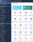
this is just the most irritating thing in UX. It makes me mad each time I go to Phoca Cart dashboard - A HUGE list of menu items in the sidebar.
It prevents quick nagivation and each time I think it's kind of a bug.
Please reduce the list of items in the sidebar. Let users find what they need in dashboard. Let there be just most commonly used items instead of all.